American Century Investments’ product pages contained dense financial information, multiple competing sections, and inconsistent layouts across products. This made it difficult for users—especially less-experienced investors—to quickly understand key details, compare options, and take action. The challenge was to simplify complex content while maintaining regulatory requirements and brand consistency.
UI Revamp Overview
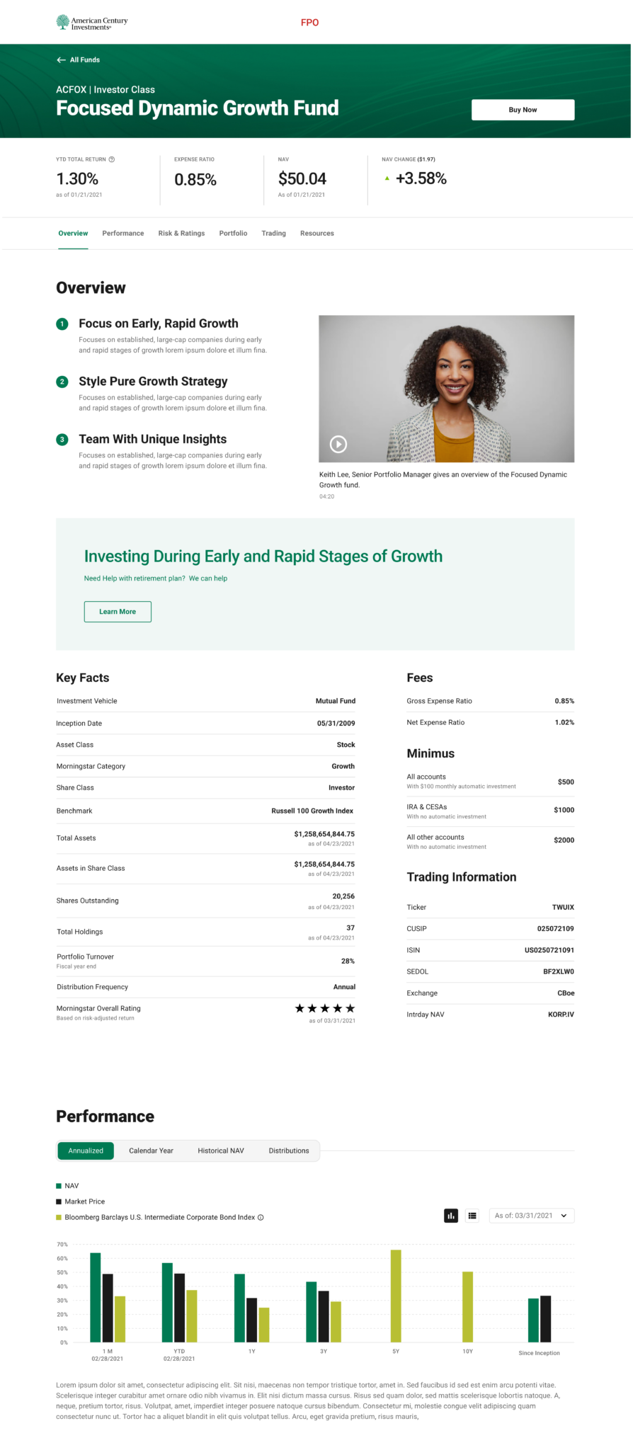
I led a UI revamp of the product pages to improve clarity, readability, and usability. The redesign focused on simplifying the layout, prioritizing the most important information, and creating a consistent structure across all product pages. Key actions such as performance highlights, fees, and investment details were surfaced more clearly, reducing cognitive load and improving scannability.
Collaboration & Process
I collaborated closely with stakeholders, UX research partners, and the design system team throughout the project. Insights from UX research helped validate information hierarchy and user needs, while stakeholder feedback ensured business and compliance requirements were met. Working with the design system team, we leveraged existing components and introduced refinements where needed to ensure consistency, accessibility, and scalability across all product pages.